Pages

Showing posts with label Art Journal. Show all posts

Sunday, January 3, 2016

"Lady Dress" Journal

I have been away too long.  Life can be quite a struggle when you are juggling too many things in the air.  One of them is bound to fall and you are so distracted by everything else that you forget about it.

My crafts and my creative soul have suffered greatly in the last few months and it wasn't until my daughter pointed out that I haven't been in my studio for over a month that it really hit me how much I had been neglecting something I love doing.

Finishing school, getting a new job and still having a second job and trying to take care of family has left me with very little time for anything else.

But over this Christmas (by the way, hope your Holidays were happy ones!) I got quite a few supplies for crafting as gifts and it gave me a spur of energy to get back to blogging and creating in my little corner of the world.  So in the next few weeks I will be posting some old posts I've saved but never posted work and work on some nee things.

I purchased a Cinch by Memory Keepers and my first try at it was this journal.  I actually created this journal a while back and put it in a box and forgot all about it.  I was re-organizing my studio and found it!

For this cover I used:

  • dress form from my Brother Scan n Cut patterns.
  • dress form from Fiskar patterns.
  • Dylusions "around the corner" stamps
  • Washi tape by Tim Holtz
  • Tim Holtz layering stencil (eye exam)
  • dictionary pages
  • Reeves vermillion acrylic paint
  • Dylusions "dirty martini" spray paint.
  • Stampendous! TC01-Marble Texture Cube
  • Drywall tape
  • Neocolor II crayons
What I did:

1. Decoupage the dictionary pages and washi tape to the chipboard and added some drywall tape strips as well as stamped marble texture to the background.  I diluted the vermilion acrylic paint with water and colored the whole thing.  

2.  I cut out heart and used stamps and drywall strips to decorate.  I cut them in half and glued them around the cover. 

3.  The dress from was also decorated with the same stamps and color as the background except I did not dilute the paint.

4.  The dress was a pattern on the Brother Scan n Cut machine and decorated with smaller hearts and Dylusions "vine" (mini).

5.  All the aging and black shadowing was done with Neocolor II crayons.


6.3  The inside of the cover was decorated with the paints and stamps as the cover with the exception of drawing larger heart s and coloring them with black Neocolor II crayon.

7.  I cut out drawing papers to the size of the cover and then used the Cinch machine by We r Memory Keepers to bind the journal together.

Overall It think is not a bad first attempt at using this machine.  i like the wire bound look and hope to get the chance to use this machine more often.

For more information on the Cinch you can visit their website or look at We r Memory Keepers YouTube channel.

Thanks for visiting this corner of my world and have a safe day.  Take care!

WonderingMindField

Monday, May 11, 2015

Art Journal Page 30

I have been on a dress kick I can seem to shake! I’ve been cutting this dress from my Brother® Scan and Cut like you would’ve believe.  I’ve made cards, bookmarks and even a cover for a handmade journal I’m working on, so after realizing these are way too many dresses, I went and made a page for my art journal. Ha!

Materials:
  • Dress and heart shapes from Brother Scan & Cut database
  • Drywall tape, washi tape, and Golden Heavy Gel (matte)
  • Dylusion spray inks: squeezed orange, calypso teal and white linen
  • NeoColor crayon: white
  • Reeves acrylic: deep turquoise
  • Stencils: Dina W. “mini half tone borders” TCW419s
  • Stamps:  Dylusions “further around the edge”
  • Flower print scrapbook, music sheet scraps
Creative Notes:

Started by gluing  strips of music sheet and then painting the page with deep turquoise, sprayed a  little water so you can still see the paper.  After is dry I sprayed it with “calypso teal” and sprayed with water to add more depth.

Washi tape (Tim Holtz®) was glued on the edges, dry wall tape on each side of the page, and then stamped leaves from Dylusions set.

Cut the 2 hearts and then cut them in half.  decorated them with washi tape, little scraps of printed paper, and strips of dry wall.  They were colored with Dylusions “squeeze orange.”  Cut 2 other hearts (different sizes) and also decorated and painted them with water down deep turquoise.

Dress was done by using printed scrapbook paper with orange background tones and giving it a wash with a little water and “squeeze orange” spray ink.  Stamped leaves and glued strips of dry wall tape and washi tape.  My last touch was to glue the phrases and then finish it with heavy gel (matte). 

Let’s hope I know can think of something else that does not involve a dress!  Have a great day and leave a comment if you think I need to stop with the dress obsession! 

Be safe and enjoy your creative journey!

WonderingMindField

Monday, March 23, 2015

Art Journal Page 29

I've been trying to experiment with some backgrounds.  It is a marvel and enjoyment to watch what other talented artist do when creating background for their art journals and it inspires me to experiment more with different techniques.  

Recently, I discovered a very talented art journal artist name “Nika in Wonderland” on YouTube.  What I enjoy about her videos is that she uses almost the same materials all the time and yet achieves such different looks.  Check out her channel on You Tube, the videos are not too long but have some very nice pages ideas.


As to this page the materials I used are:


--Dylusions® spray paints:  lemon zest, pure sunshine, and after midnight

--Stencils:  Ronda Palazzari® TCW396: Arrows and Hearts; Joggles® “Floral Fantasy mask 10-33764; Prima Stencil® “Camera” #564292; Tim Holtz® “Bubble” THS002; Texture Shine stencil style No.88505; and lettering plastic stencil.

--Dry wall tape for frame around camera stencil

--Reeves® Silver acrylic paint

The process was really about spraying and layering with the stencils until I got the look I wanted.


I started with the light colors and then with the Joggles Floral Fantasy stencil used the Dylusions after midnight spray paint to add texture to the page.  The camera silhouette I created with the Prima stencil “Camera” (564292) and used modeling paste to created some dimension.  I colored it with a silver paint marker.


This page took me about 40mins and I created at 11:30pm because I could not sleep.  It was very relaxing and calmed my mind enough to go to sleep.  I think this was better than a sleeping pill…tempting as that might’ve been. Sarcastic smile


Have a good night (or day!) and the lesson is if you can’t sleep then do some art!


Wonderingmindfield

Thursday, March 5, 2015

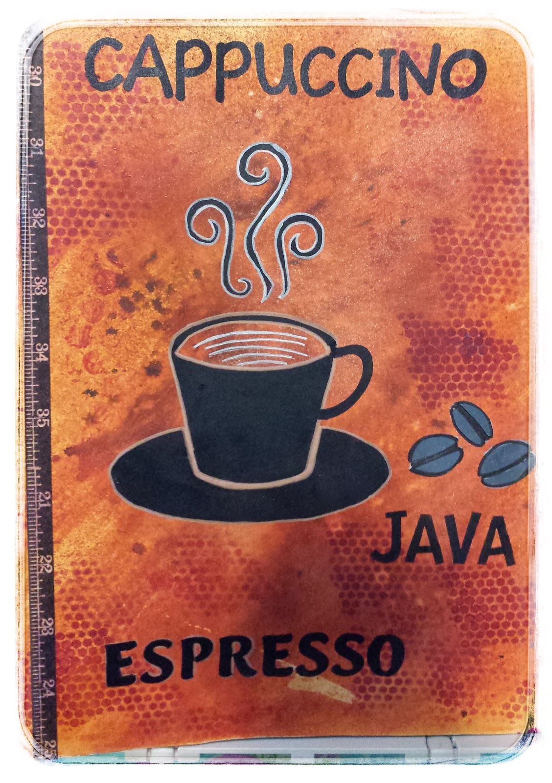
Art Journal Page 28: Coffee!…Java!… Café!

Coffee!…Java!… Café!…No matter what language is still the morning vitamin for many, specially my husband.  Now, I am Puerto Rican and coffee is in your blood at birth, so I had a taste for it when I was young and love to have it with hot milk, then I would dunk soda crackers with butter on them and just eat them for breakfast before going to school. Now don’t judge my mother this was many, many years ago and we know better now..she did diluted the coffee with the milk.  It was just a cultural thing!

The point is that I love it so much that when we came to this country back in 1987, that morning right before heading for the airport, I sat and had a tin can of coffee with milk and a small stack of crackers covered in butter and said my mental goodbyes to my town, friends and my morning coffee as well as my life as I knew then in Puerto Rico.  That was the last time I had coffee, 28 years ago.

I saw this stencil for $1.25 and since I can resist a bargain I got it and created this page reminiscent of my past love of coffee.  Materials I used are:
  • Background:   Dylusions® Melted Chocolate spray paint and Tim Holtz® “Wild Honey” Distressed Stain. I used stencil by Tim Holtz® Mini Texturized TCW437 with Folkart berry wine paint to create texture.
  • Folk Art® Licorice Cup and Lettering for the coffee cup which was stenciled using Reeves® Payne’s Gray acrylic paint.
  • Washi tape for the side borders and black and gold paint markers to outline the cup and coffee beans.
A quick and no fuss art journal page to keep the creative process going, specially when time is short and you just want to do something different to relax.
I am by no means an experienced artist but just a beginner that enjoys the process, I believe is about the journey not the destination.

Have a blessed day and keep creating.

Wonderingmindfield

Wednesday, February 25, 2015

Art Journal Page 27: In Honor of New York!

I am from the Boston area and anyone that know even a little about baseball know all about the rivalry between the Red Sox and the Yankees. 

Well I love the Red Sox, but I also enjoy visiting New York City.  There is such great diversity of activities and you get to see people just from all over the world in every corner you look.  Is like visiting different countries in one place.  So I got this stencil at a clearance rack and really love Lady Liberty.


The funny part is that I have visited New York City many times.  I have seen different Broadway shows, gone to museums, gone shopping, but I have yet to go the the Statue of Liberty.  Seriously lacking in the tourist department! 

This is a city that have been tested and has survived great tragedy, it deserves a little shout out once in a while.  As someone from a town that has also seen tragedy I can feel kinship with this city.  I have nothing but positive experiences in my visits there and will always look forward to going back.

Materials I used:  Stencil Plaid Folk Art® NYC Set #30971, numbers washi tape,  drywall tape and little squares stencils for texture.  For Lady Liberty I used modeling paste to give it some dimension and I colored the paste with mint green acrylic paint.  The page background was colored with Premier® "Purple Red" acrylic paint.

In honor of New York and all its great people is this journal page.


(p.s... I'm still a Bostonian at heart...and still looking for a Boston stencil…meanwhile, Go Red Sox and the Patriots!!!)

Have a great and safe day and let your mind if not your body travel the world!
Wonderingmindfield

Friday, October 31, 2014

Art Journal Page No. 26

Is it really enjoyable when you are able to use a a stencil in different ways and still find inspiration in them more than once??  Be right back

Here is another page I created using the  © Madartists | Dreamstime.com - Woman With  

Long Hair stencil I made with the Brother Scan & Cut machine and Duralar clear film.  I was not sure where this page was going, but it was 12 am and I could not sleep.  I had been studying for a final exam and had a little too much energy, so I got my art journal and this is the result.

My process & materials:
  • Dry wall tape and glued a couple of strips to the page.
  • I got this flyer from Trader Joes® supermarket and I don’t know if you know the look of the flyer but it has a old world look to it and it is designed with images from Victorian ages.  Really cool flyer to add background to your pages.  I also used some strips of music paper from an old book of rhymes I have.
  • I applied some gesso to softened the edges of the scrap the paper then used Inkadinkado Stamp #60-00435 “My thoughts are free to go anywhere….” to add more words to the background.
  • Dylusions Spray Paints:  London Blue.  With a brush I lightly spread this beautiful blue over my pages to add color to the background.
  • Folkart® “licorice” black paint: I stenciled the lady face at a angle on my page. I added a few more strand of hair to give it a fuller look.
  • Tim Holtz® Layering Stencil Eye Chart #THS010: With the Berry wine Folkart® HD paint I stenciled the eye chart randomly around the page and slightly on the side of her face.
  • Dylusions “Teal Calypso” spray & Ultramarine Blue acrylic (ProArt): With a wet brush and mixed this two colors and added the darker shade of blue aroun the face and around the page.  I just kept adding color and contour to the face, leaving the front of the face lighter for my final touch.
  • Prima “Gardenia” Stencil by Jamie Dougherty: With some modeling paste I created the 3d flower. 
The message I was going for in this  page was to remind myself that I had to remember to take deep breaths and have some rest in order to complete all the demands in my life.  Sitting down and letting this page come to life calm my mind and sleep came to me.


Find your calm and be safe…

WonderingMindField

Monday, October 27, 2014

Art Journal Page No. 25

Did I mentioned how much I love stencils?  I reallyyyy love them.  So I got a few of them recently on sale and decided this is my page using all this lovely stencils. 
My Process & Materials:
  • Strips of music paper and Tim Holtz® washi paper tape
  • Tim Holtz Stain “Spiced Marmalade” for background color and mute the strips of paper pasted to the page.
  • Joggles “Spirals (10-33738)” for background that’s the spiral shapes on the background. I used Reeves® viridian and silver to add the stencil shapes into the background
  • “Art is…” Mini 6x6 Stencil TCW 261s: I taped the stencil with blue painters tape and using
    modeling paste and made a dimensional imprint of it in the page.  This is a technique I really love doing with stencils.  It adds great dimension and interest  to the layout.
  • Zenspirations 6x6 Mini stencil TCW465s.  I used Folkart® HD “licorice” (black) paint to stencil the design.  This is the first stencil I have found from designer and creator of Zenspirations, Joanne Fink, and I hope there are more to come.
  • Other thinks I used to add to the background were: Metal heart shape and Plaid® Swirl Stencil to add more interest to the background.
  • I outlined the butterflies with Permapaque Sakura® marker in gold and silver.
The stencil I used with the modeling paste (TCW261s) has this message:

“Art is just another way of expressing our innermost thoughts onto concrete media.  Where form and function come together in beauty color and shape. We put our feelings and experiences onto paper, canvas, surfaces of all kinds.  Following ourselves to release and surrender to this all encompassing force.  This need to register what was today, what might be tomorrow.  Find what was yesterday and the day before that.”


This is a great message and loved using it in this page and I have used it many times as background on some of my other pages. 

Let your art speak for your soul and always remember to find joy in it…

WonderingMindField

Friday, October 24, 2014

Art Journal Page No. 24

I have mentioned the Folkart® HD Paints that unfortunately have been discontinued, and lucky me I had bought a bunch of them before they were taken of the shelf.  The are creamy and they have high shine to them that makes them have an oil look to them without the smell and the long drying.
Materials and notes:
  • Dictionary paper paste it to the background.
  • Reeve’s Acrylic paint: Viridian to color the background.
  • Conte a Paris to draw the outline of the flower, plants and butterfly.
  • Permapaque™ Sakura Marker to trace the outline after I was satisfied with the layout.
  • Folk Art® HD Paints:  Engine Red, Yellow Citron, Magenta and Turquoise. To paint the flowers and butterfly.
  • Sakura® White Gel pen for the writing.
The last thing I did was write some inspirational works on the leaves of the plant next to the flower and a little message on the corner with the gel pen.

This was a quick and easy page done in an hour and half while listening to some music and just enjoying the quite in my studio.

Keep safe and enjoy the calm…

WonderingMindField

Friday, October 17, 2014

Art Journal Page No. 23

I wanted to make something whimsical and I saw this image at Dreamstine.com and really liked it and wanted to make something with it.  I have Brother Scan and Cut machine from my husband and daughter for mother’s day and could not wait to try making a stencil out of this lovely image.

My process:
  • I took Duralar® .005 Clear film which is a acetate alternative and worked pretty well for cutting in the scan and cut.  As a try out it works well and I can use the image a few more times. 
  • Materials I used to create the background:
    1. Paper:  Michael’s “Songs of Spring” packet
    2. Writing:  Stencil TCW261s (6x6) Mini Art Is…
    3. Paints:  Reeve’s Deep Turquoise acrylic, Titanium White, and Silver
    4. Folk Art® Clear Medium to make the paint for fluid.
  • I paste scraps of the paper and the butterflies were cut out of the paper I paste on the paper.  I also used washi tape strips and with the stencil I stenciled the phrases on the page.
  • The deep turquoise was thinned out with the gel medium and I colored the entire page.
  • Using the titanium white and stenciled the image and then with the silver I did some shading.
I love the color turquoise is one of my favorite colors and any time I get to use it makes me happy.  Than is the idea of art journal, use colors that bring you joy and give your soul a boost.

Be safe and be well…

WonderingMindField

Tuesday, October 7, 2014

Art Journal Page No. 22

Started this journal pages because I wanted to use some stamps with a skeleton theme on it.  I 20140905_220739started with red acrylic paint and did stamping with a few stamps I have. (Pic.#1).  Then I had to leave for school and when I got back I realized I had no idea where to go from there in order to finish the page.  I had no real inspiration so started to just do some writing and left the page alone again.  Did some Zenspirations instead. Nyah-Nyah

A couple of days later I found some images on online and found this really cool skull image and inspiration struck me! Let create a Mexican skull in honor of Halloween. 


I downloaded the image then with carbon paper traced the image into the page.  I used Sakura Permapaque fine point marker to outline the image.  I then used Folkart HD Paints to color the skull.  I really like these paint because they give a oil pain look to the image (it looks better in reality). 

Unfortunately I believe these paints are discontinued, I got my paints a couple of years back and thankfully I stocked up.  Thank goodness they have a long shelf life.

I finished by outlining with black and silver Sakura Permapaque and here is the finished product:

Always trust inspiration is just around the corner or a few mouse clicks away as in this case.  Be safe and always inspire your soul...

WonderingMindField


Friday, September 26, 2014

Art Journal Page 21

My daughter and I were talking about setting up a travel fund so that some day we could take a trip to Europe.  This is a dream we both have had for a long time and hope to some day be able to make our dreams come true. 

Her dream place is London and Paris.  London has also has become one of my favorites since that country loves crafts.  They have some pretty cool craft magazine and supplies are to die for. My dream is to visit both Spain and Italy as well so I better start that fund, pronto!!  Here is the journal page our dream inspired!!

Some of the materials I used were:

  • Tim Holtz Distressed Stains
  • Dictionary paper for background
  • Inkadoo Marble stamps to add the cracks in the background
  • Bubble wrap for the circles.
  • Tim Holtz paper (washi) tape at the edges
  • The lady stamp was a flea market find and it did not have a label! Sorry!!!
  • I used some letter stencils to write the words.  
New York happens to be one of my favorite places and luckily I only live about 4 hours away from it and have been able to visit a few times.  My husband and I love it at Christmas time.  Is full of life and so many different people, shops and theaters.  I have been lucky to see a few shows as well and hope to back soon.  My favorite Broadway show is the "Lion King." Beautiful production!

If you are lucky enough to travel to your dream places then let it inspire you and enjoy every minute of it. If your dream still not realized, then like me look at pictures and travel with your mind and creative soul!

Be safe!

WonderingMindField


Wednesday, September 3, 2014

Art Journal Page 20

You know that sometimes is hard to make something when you are not really inspired to, but the lesson I learned is, that is ok, I can always come back and do something later.  This page started with the background which I created using some red and orange spray inks then with a Ranger™ red ink pad and a Stampendous® Cube Marble Texture Cube (TC01), I created the marble effect on the background.  Having done that I took my stencil and drew the shape on the page, and that’s when inspiration dried up .

I taped a strip of washi tape and them stared at the page for the longest time with no idea where to go next.  So I decided to just let it go and walk away and do something else, like going on Pinterest® and see other people’s spectacular work.  What can I say, it was not a very good day to create anything.

About a few days later I came back to the page and still nothing, so I decided to just color the branches with some acrylic paint and see where I would end up.  I finished with the dark brown and still had no idea what else to do, again I walk away! (depressing)

Now after a week of no art journaling I went back to that page and decided to just write something.  I had seen a Art Journaling magazine that week and an artist would paint faces on the page and then write different quotes on them.  So I looked up a few quotes that spoke to me and with a blue gel pen when to town on this tree.

Here are some of the quotes I wrote:
“Great lives all remind us; We can make our lives sublime,and when departing, leave behind us, Footprints on the sands of time…” - Henry Wadsworth Longfellow
“It matters not who strait the gate; How charged with punishments the scroll; I am the master of my fate, I am the captain of my soul…” - William E. Henley
“To leave a legacy is to take care of our children and given them a future.” – Consuelo Morales
“Only time will bring forgiveness to our heart…” – Consuelo Morales
 I continue to fill in by just writing random words of meaning to me and then decided that this page had ended.  The one thing I realized while writing the quotes down was that I need not to fuss so much about a finished project.  Total control is impossible!

Have a great and safe day and keep searching for more creative joy!

WonderingMindField

Tuesday, August 12, 2014

Art Journal Page No. 19

Feeling very tropical!!! 

Always been fascinated with mermaids.  I think the idea of an under water world is very cool and just plain fun.

To be ale to breath under water and discover all those coral reef and amazing marine life is the stuff of dreams.

So I took a mermaid tail and a paper doll form I had and combine the two to created my very curvy mermaid!

Creative Notes:

I started with decoupaging some scraps of music sheets and drywall tape (my favorite) to add the wave movement effect of the ocean.

I followed with the mermaid, which was created by taking several pieces and putting them together.  I drew the tail then the upper body form and finally glue them together.

The corset was from a stamp I have from Enchanted Gallery.  I stamped the form on card stock and then cut the form out and used it to trace the form on a emerald green scrapbook paper, then cut it out and glued to the corset form, I also decorated the paper with some stamped swirls.

The hair was the tricky part, but I printed the hair from some clip art I had saved and them cut the hair out and colored with red markers.  I then colored the background of the page with turquoise acrylic paint and then aged it with Tim Holtz® distressed ink pads.

For a flowing look I took a white pen and drew the leaves to mimic seaweed under the water.  I finished the whole thing by using Tim Holtz distressed ink pads and just stamps the long streaks of brown you see all over the page, like old bubbles!

I enjoyed this page and its whimsical feel.  That is the idea after all to just create to give your creative soul a chance to soar.

Have a great day and enjoy your journey, you only get one chance at it!

WonderingMindField

Tuesday, July 22, 2014

Art Journal Page No. 18

I have no idea where I was going with this.  It started with trying a new technique with chalkboard paint and a new white pen I got and after the whole thing was finished and I was very proud of it, I tried sealing the page, that's when it went wrong.

You see sometimes I am not the most patient person and I thought that by using the heat gun i could speed things along.  Well I should have first tested the white pen first and not do all the work and then find out it smudges if you try to seal the work with clear medium.

After the mistake I took a step back and decided that i would keep the way it was.  i rather liked the foggy feel to it.  Very Halloween like! i really enjoy that holiday and this is me missing it, mistake and all.

Is about having fun...so keep creating and always find the positive in your creative accidents.

WonderingMindField

Monday, July 7, 2014

Art Journal Page No. 17


Art Journal Page 17“Embrace your curves and live for yourself at peace.”

Lots of texture and color for this page.  The true is that I started this page with one idea and the color went bad on me, so I walked away and cooked supper and let the page dry really well before tackling it again.  I find when you have no inspiration and things go a little wrong with your art that is a good thing to walk away from it and try not to force the ideas, but to let them come to you. 

Notes:
  • After a rocky start with a purple I absolutely hate it and decided to keep going and glued some strips of paper  and covered it with some gesso.  I then took some Dylusions spray ink and used crushed grapes and some fuchia and created the color on the background
  • I have a lot of washi tapes and love it when I have a chance to use them.  I took some strips of different patterns and taped them to the right and left of the page and to add even more texture I took strips of window screen material as well.  I find this screen material really nice to work with.  I actually like it better than lace.  It is thin and flexible and does not add bulk to the page.
  • On page 10 of my art journal I used a template from stamps I purchased from The Enchanted Gallery that I really like, so decided to use the corset and wings and cut-out the stamped image. 
  • I also have a TimHoltz® dress form die I cut and glued to page.
  • I drew and cut a skirt and glued all the pieces together (dress form, wings, corset and skit).
  • The mirror on the corner is a sticker I had on my scrap pile and I just glued it and wrote my quote. 
  • With some $1 unmounted stamp that mimic writing I lightly stamped all over the page to just add more interest.
  • The final step I did was take modeling paste and just randomly applied it with a putty knife to give it that peeling wallpaper look those very old abandoned homes have.
Honestly I like the way it turned out.  I started with no inspiration and a color I did not like to a page that shows the girly in me.  Trust me that is not something I show often!! 
Lesson here is that with art journal there are never mistakes, just opportunities waiting to be found.

Have a great day and thanks for visiting.
WonderingMindField

Monday, June 30, 2014

Art Journal Page 16

Having a difficult day has a way of showing itself on everything you say or do at the end of that day.  I guess I’m not making any sense…it started with a very crazy day at work.  Everyone was at each other’s throat and nothing seem to go right.  Arguing, yelling and just difficult customers is a great start to ruin your day and after 8 hours it did not improved! 


As soon as I got home I took care of the family, went and took a long shower and closed myself behind my studio doors.  The result was a a little angry kind art journal page, or at least in comparison to the others. 

I took all kinds of different green shades and gesso and created the background first.  I had this piece of scrap of paper from an old book and glue it to the corner and from the same page took strips of paper and glued forming square around the page.  I also used my trusty drywall tape to add more texture.


“There are times when dreams can seem far and dark…But only our hearts will get us there…”

That’s my quote for this page because I do believe that in order to get through the difficult times we must let our hearts guide us and that the road to make our dreams come through can seem dark and far.  We need to make our own reality and let our heart guide us through the road to make those dreams come true.

Just remember to look at yourself in the mirror once in a while so that you do not loose sight of who you are.

Have a safe journey finding your reality.
WonderingMindField

Monday, June 23, 2014

Art Journal Page 15

I was looking at some pictures of my days in high school and realized how much I have learned in the last 25 years (yes.. that makes me old..do the math!)  This page was in honor of that 17-year-old girl who did not know what was waiting for her down the road of life but hoped her dreams would come true.

Creative process notes:
  • I decoupage the page with some old book pages using mod podge and a heat gun to dry.  Some wrinkles occur but that was just part of the charm.  It added texture and a more aged feel.
  • With a dry foam brush lightly dipped it in gesso and cover the entire page with a very light touch.    The idea was to mute the harshness of the pages lines. 
  • Added some washi tape strips top an bottom of the page and then randomly on the page to add texture to the background.  I also used small strips of my trusty drywall tape to add more texture.  I love this tape as much as I love stencils!
  • I took a face drawing I had on my computer that looked a little like me at 17 and printed it.  Then using carbon paper I traced the image into the page and with black acrylic paint I went over the lines to make.

  • With a opaque marker I highlighted the hair lines to make them stand out and give the hair a softer look.  I also colored in the inside of the eyes to make them stand out.
  • With yellow ink spays I sprayed on palette paper and them with a brush colored the entire page.  I sprayed on the palette paper so I would have more control on where I wanted it to be more or less brighter.
  •  Using Dylusion “crushed grape” ink spray I colored the hair and random spots on the page.  Again I sprayed on palette paper and then with a brush colored the hair so that it looked smother instead of spray on.
  • To finish I stamped some swirls and then using Tim Holtz™ Distressed ink pad (“mustard seed”) and a felt sponged distressed the page to blend everything together.

I visited my past self while creating this page so emotions ranged from happy to sad to accepting that not all dreams come true but that the lessons learned shape the heart and soul of the girl and the woman.

Have a great day and create to bring peace to your soul.

WonderingMindField

Monday, June 16, 2014

Art Journal Page 14

Simple but vibrant!  I had only about an hour and wanted to create something quick and simple. I know! more stencils, but I love them.  I got “Poppies” by Julie Fei-Fan Balzer and created this simple page that was quick but happy!

Creative Notes:
  • Using some Dylusions spray inks (Cherry box and squeezed orange) I created the background on the page. 
  • After the ink was dry with a mister I sprayed water on the page to create texture and them with just a regular piece of small bubble wrap I pressed it down to add all the different blotchy texture on the background.
  • With a black sharpie® I drew the curved lines around the page and then traced again with a white opaque pen to make them blend on the background.
  • With the same Sharpie® I took the stencil and traced the flowers in the page.
  • With gouache paints I colored the flowers with orange, yellow and green.
  • Using the white opaque gel pen and traced some line on the leaves.
  • I typed the phrase: “it’s the inspiration in my soul that keeps me nourished” in word.  Leaving a few spaces in between the words to allow for cutting.  I also printed in different sizes to fill the blank space better.
  • I took a distressed ink pad by Tim Holtz™ (“barn door”) and with a piece of felt distressed the page even more so everything look blended and aged.
  • The date stamped at the bottom is the day I wrote the phrase on another journal I keep by my bedside table.
The lesson here is that all you need is a little time, a few supplies and some quiet time and we can create something pretty that brings us creative joy.

Have a great day and keep your soul nourished!

WonderingMindField

Tuesday, June 10, 2014

Art Journal Page #13

Art Journal Page 13Can you tell I was really in a “Spring” kind of mood?  I used an inexpensive stencil I got at a flea market.  It did not have a label, so I’m sorry to say I can’t give credit to the manufacturer.  Instead of going the conventional way and use paint to stencil the design on my page, I used modeling paste. This gave the page dimension and texture. 

I had no real idea of what I going to put on the page with the exception of the stencil, so I got my box of scraps and just pulled things out and laying them down.  What can I say is cheaper that therapy on a stressful day!
Here are my creative notes:
  • Using Dylusions “cut grass” spray ink and water I colored the background of the page using a sponge to spread the ink on the page and a heat gun to dry it.  I’m a little impatient.
  • I position the stencil where I wanted and using painter’s tape I  secured it down on the page.
  • With a small painter’s spatula I spread the modeling paste over the stencil.  Carefully!  So that the modeling paste did not spread too much underneath the stencil.  Using the spatula I carefully took off the excess.  It’s like spreading icing on a cake!
  • Let the modeling paste set for a minute and then remove the stencil.  You do not want to wait too long because the paste will set and may crack, plus the  stencil can get stuck and crack the paste when removing.
  • Using Mod Podge I glue little scraps of printed pages, washi tape, handmade paper, and my favorite drywall tape, randomly around the page.  I was going for sort of a cloud effect on the top and wind blowing around the tree.
  • I had a $0.50 stamp in the shape of a feather and just stamp over my paper scraps groupings. 
I had either seen or heard that when doing a art journal page that you should create balance on the page.  I sometimes have a little hard time achieving this, so for this page I tried that by forming the small groupings of scraps paper around the tree.
  • I cut some little leaves and glue them to the bottom of the tree just to fill in more of the page.
  • After the modeling paste is completely dry I colored the entire design using a small brush and water-down acrylic paints.
If you want deep colors a few coats might be needed and less water.  I was going for a light touch since the green on the background is more vibrant.
  • I took the foam brush and lightly dipped it on the gesso and sort of dry brush around the page, again to give it a cloud wind effect.
  • I used glaze medium and brush it on the entire page to protect it. 
Oh!  I forgot, I stamped “A good Life” on the page from yet another flea market find.  It is not fancy but it makes me smile.  And isn’t that what you art is supposed to do?

Stay safe and keep creating so that your soul can smile!

WonderingMindField

Monday, May 26, 2014

Art Journal Page #12


 I’ve talked before about finding my creative joy and as I think about what to write for this blog I realize that joy can come in many forms and at different times in your life.  It does not have to be an everyday emotion but when it comes it makes an impact.  Creative joy, personal joy, etc, etc, are essentially the same and your heart feels it the same way.  For me is about trying to let my mind find calmness and balance in order to be able to appreciate what matters to me and to learn how I interact with the world. 

This page is for my daughter who is our greatest joy.  No matter what is going on in our lives, my husband and I just need to look across the hallway and look at this person and see the reason we still have a fight in us to get through life.  Yes, she is an only child and some might think that putting so much importance in one person isn’t healthy, but as a mother and father we feel that every child should be that important.  they are after all our future and my believe is that if she ever has child because she knows she is loved, she will give that child the same love, and the chain will continue on.  Isn’t it better to leave that kind of legacy?  The world has enough cruelty in it already we do not need to add to it my neglecting our children.

(This page is named Wondering Mind Field because my daughter and I love creativity.)

Project Notes:
  1. Sprayed the page with turquoise watercolor paint, then using ModPodge™ glued some strips of paper from an old book.  Took some gauche paint and with some bubble wrap created the bubbles on the side of the page to create texture and balance.
  2. I have some Jane Davenport Girl Profile Stencils (click link for shop) I purchased from the Crafter’s Workshop and traced the faces with a Sharpie®.  I wanted clean lines instead of paint.
  3. With Mod-Podge™ I pasted some dry-wall tape strips to add texture.  This tape is my favorite and I find myself constantly reaching for it when journaling.  I also took some coordinting washi tape (love them!) and added some more layer to the page.
  4. I also used a simple stencil that had a pattern of small quares and with modeling paste added even more dimension to the page. 
  5. With Tim Holtz® Distressed Ink Pads, Recollections® phrases stamp, and Ranger Blue Archival Ink pad I added all the background distressed look with words.  I also used a spray water bottle to spray on to add the smudge look to the background.  i covered the faces so I would not smudge too much.
  6. The faces i colored the front one with the Distressed inks and a wet brush to represent the older generation (Me) and the back one i left it clean and new looking to represent the new generation (my daughter).
  7. With a black felt marker I drew the half circles on the edge (Doodling) and some mini stamps of butterflies and flowers and stamped them using Ranger® Black Archival Ink.  I outline all the doodles, flower, and butterlfies with recollections® white Opaque marker.
  8. The last touch was a cut out of a antique fountain pen.
  9. I sealed the entire pages with semi-gloss gell medium.
If you look at the page it has all the passions and interest my daughter and I share, which are:
  • Words – representing our love of reading.
  • plane (washi tape) – our love for traveling
  • Pen – our obsession with pens
  • The entire page – our love for art.
Thank you visintig, be safe and keep looking for your creative joy
WonderingMindField